Suohki
Vi på Maryland är stolta över att ha arbetat fram en
grafisk profil, logotyp och webbplats till företaget Suohki
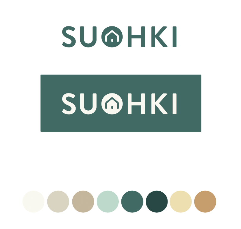
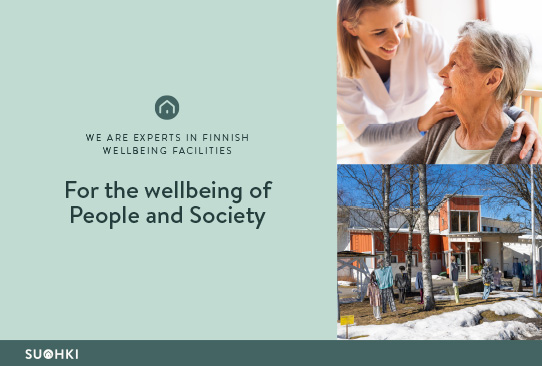
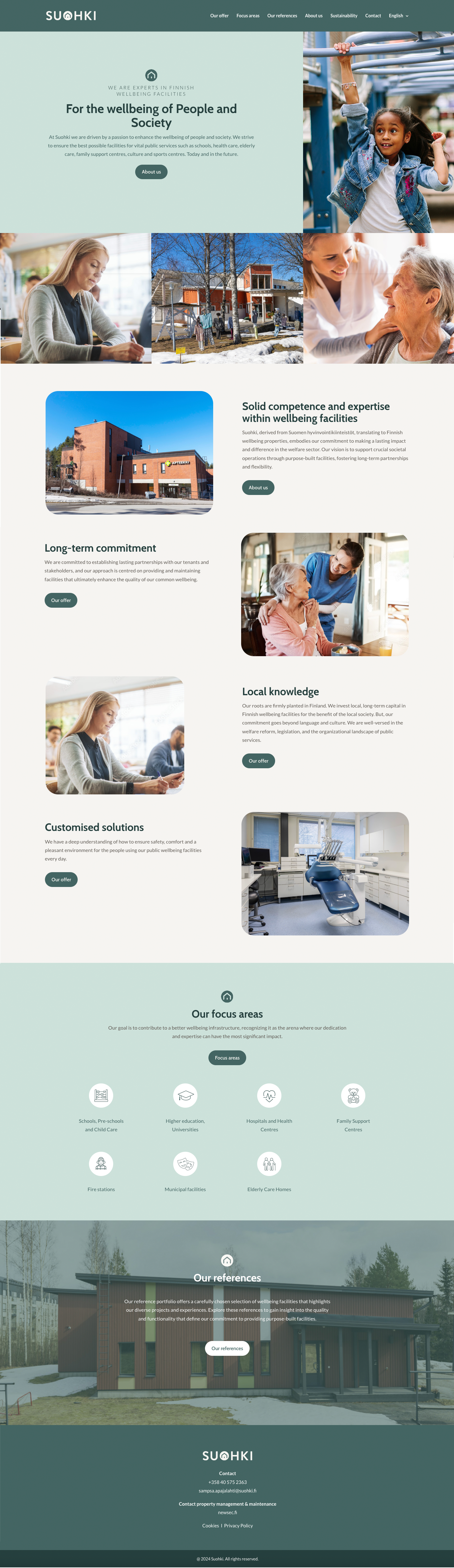
The name Suohki is an abbrivation of Suomen hyvinvointikiinteistot which means Finnish welfare properties. The name has a distinct Finnish touch and quickly establishes the company’s finnish origin. Suohki is the company brand name and the logo is built around this name.
The logo features the word ”Suohki” accompanied by a house symbol within the letter O. The incorporation of the symbol within the O, forming a circle, serves to emphasize and symbolize Suohki’s presence in the real estate industry. This placement within the O also conveys the company’s core values of care, responsibility, and professionalism. The logo represents a harmonious blend, where the soft and caring elements intersect with the strict, responsible, and corporate aspects.
Visit the web: suohki.fi
Kategori
Digitalt
Design
Copy